

Branding—Quakefit
Tools Used: Adobe CC—Illustrator, Photoshop, HandSketch
Share this Post
Quakefit is a public awareness tool about earthquake safety. PBRV was tasked with creating a logo and identity for the tool as well as developing the tool itself.
OUR SOLUTION
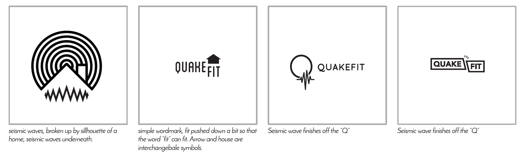
The requirements were captured and the values and symbolism that would describe the brand includes; sturdiness, seismic, timeless, subduction, stress and awareness.
 Initial logo sketches & ideation
After the initial sketches were presented a clear direction started to be zeroed in on.
The final logo was tweaked a bit and colour was added to represent safety while being appealing to the general public.